Iterative Design
Hellosaurus
Overview
Iterative design is a design methodology based on a cyclic process of prototyping, testing, analyzing, and refining a product. As part of a UIUX course project, we, a group of 4 students, designed an emerging startup interface using this approach.
The startup we focused on is Hellosaurus. It is an interactive video platform for children who can play with episodes instead of just watching. Since these videos are better viewed on bigger screens, and kids are likely to have better access to laptops than tablets or phones, we chose laptops as our interface.
Sketches
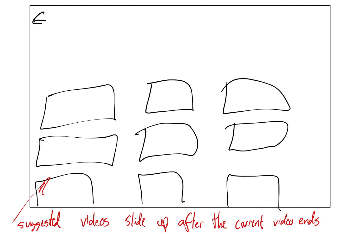
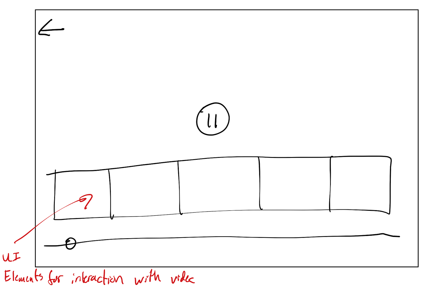
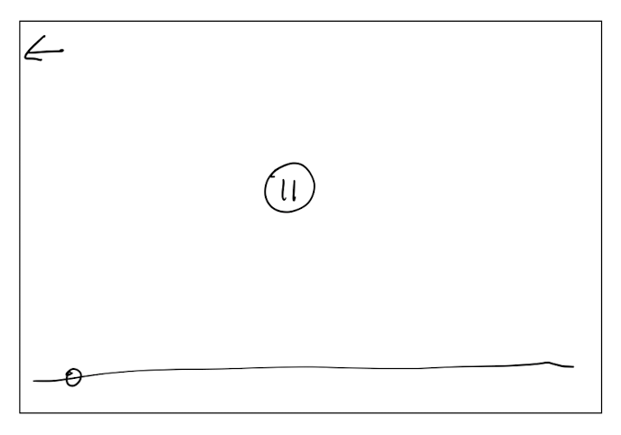
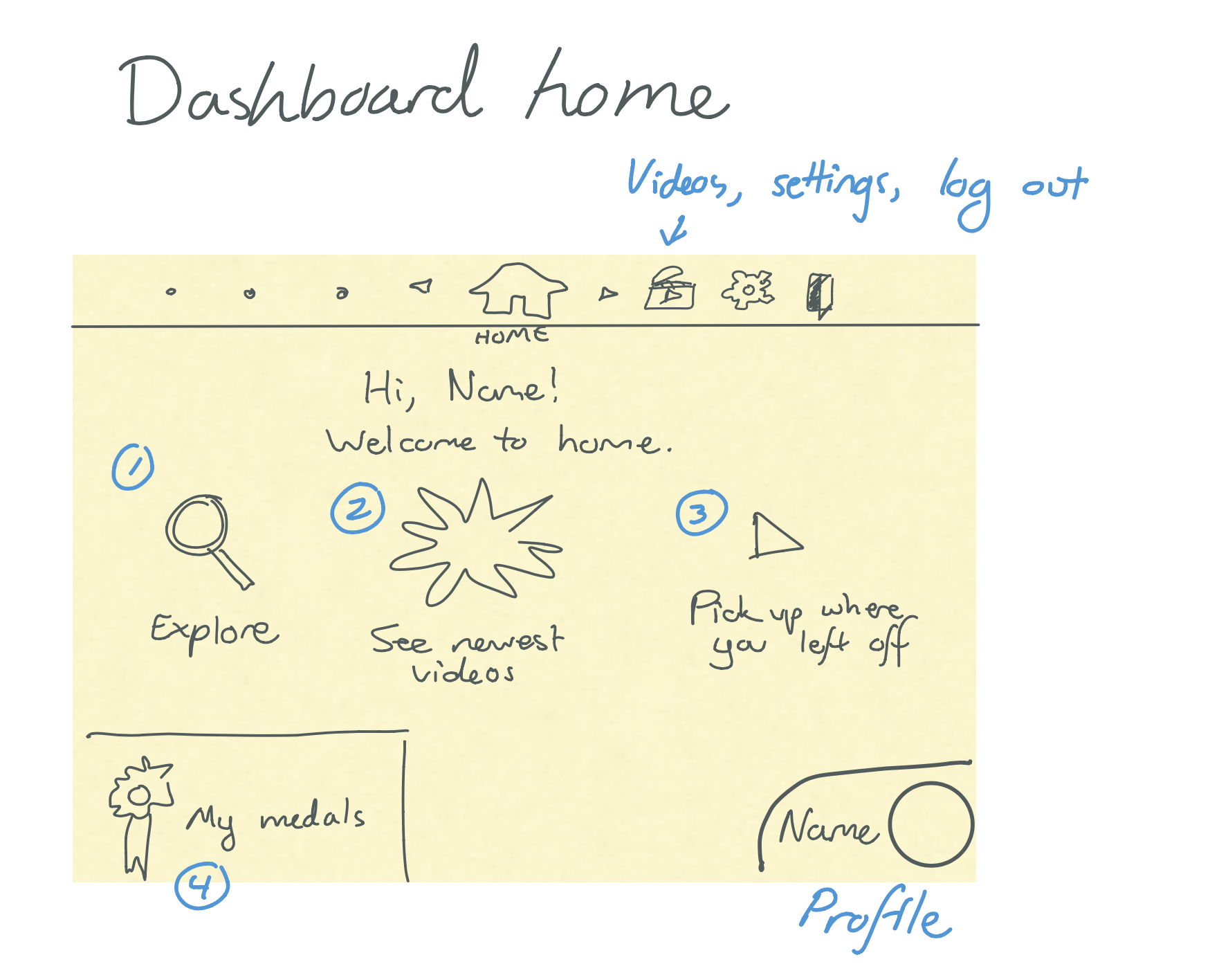
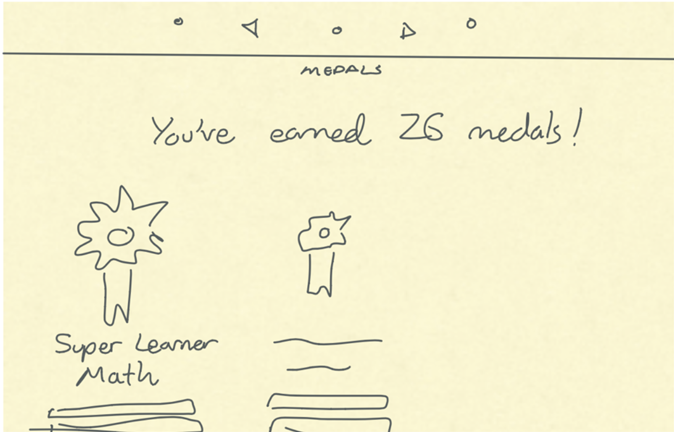
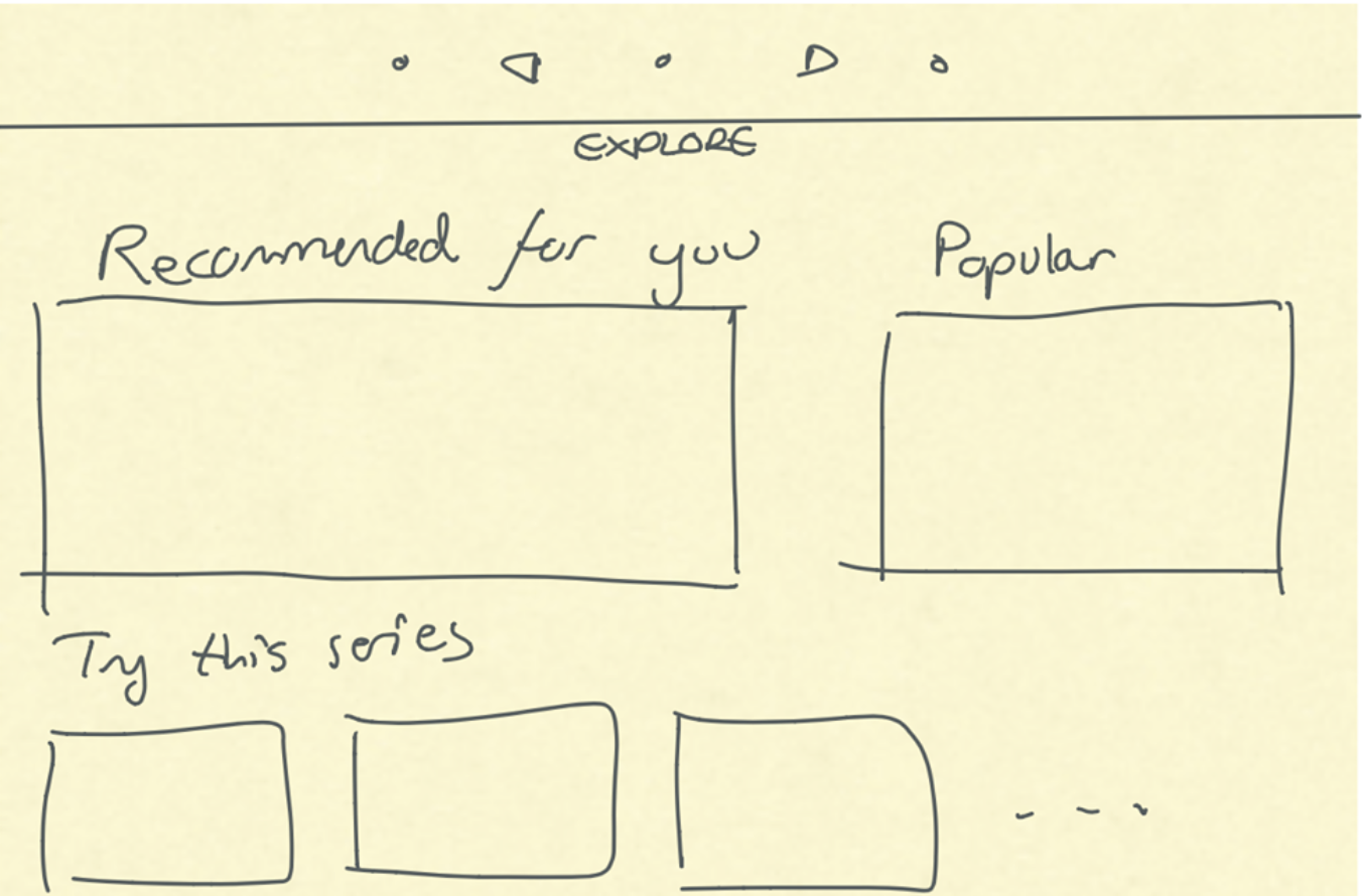
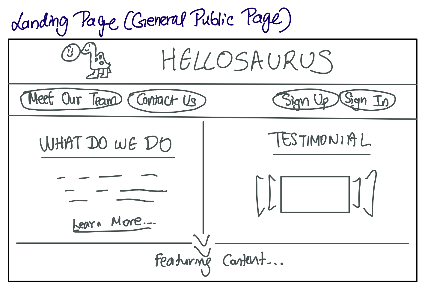
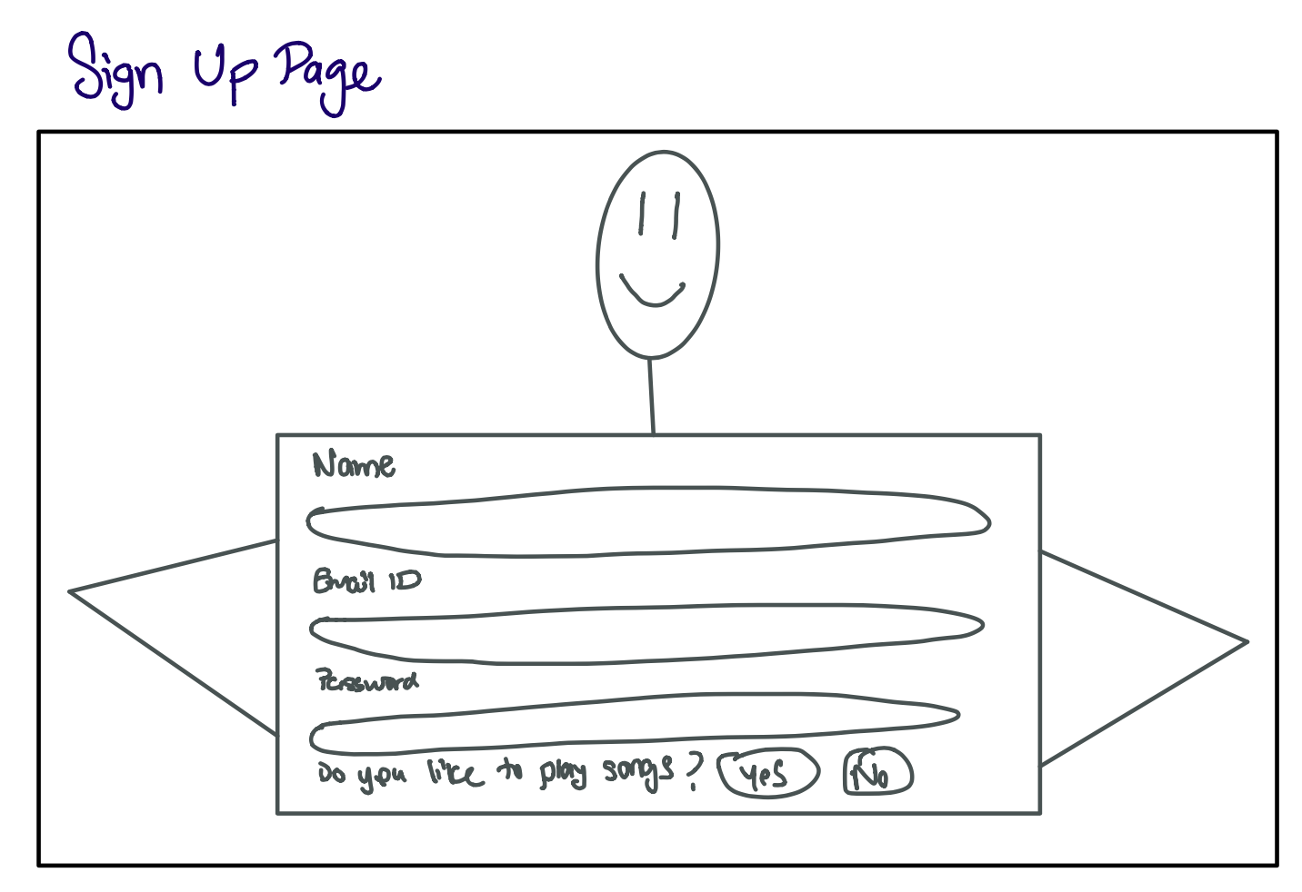
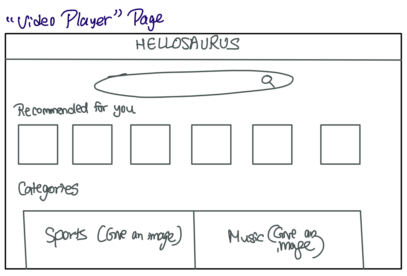
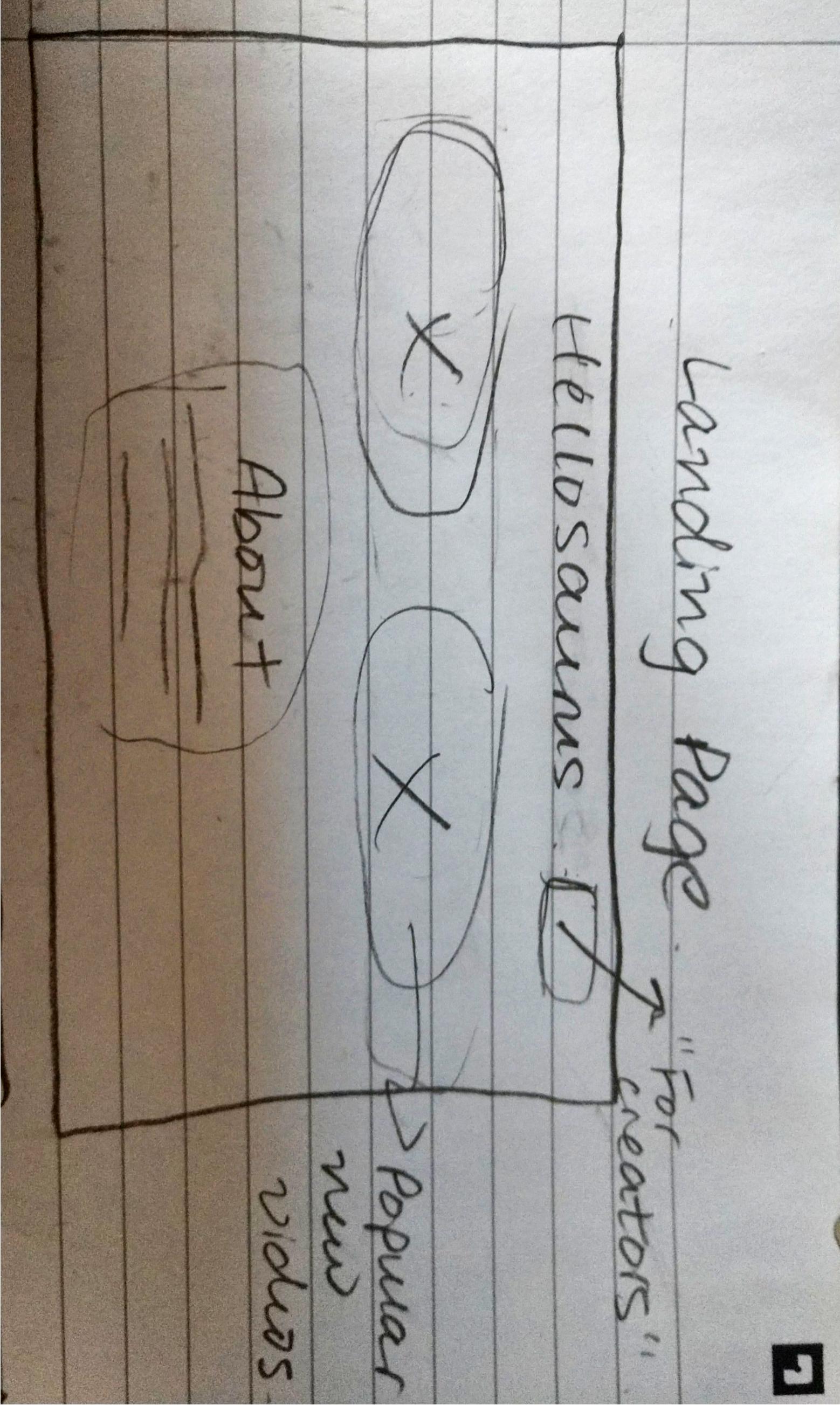
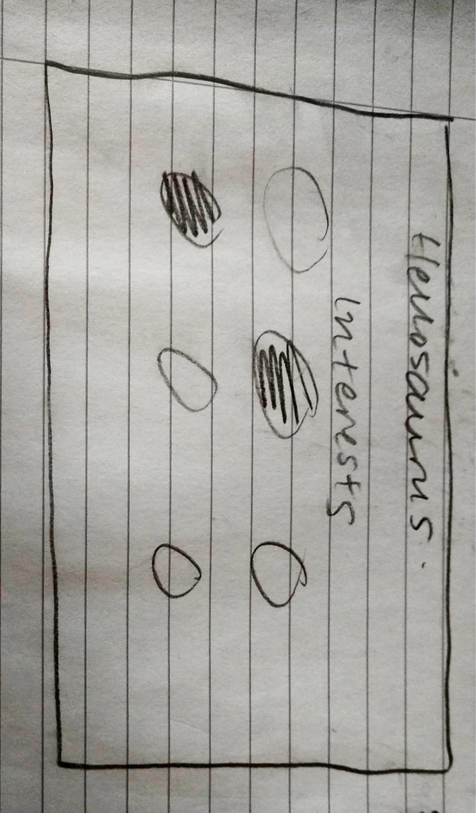
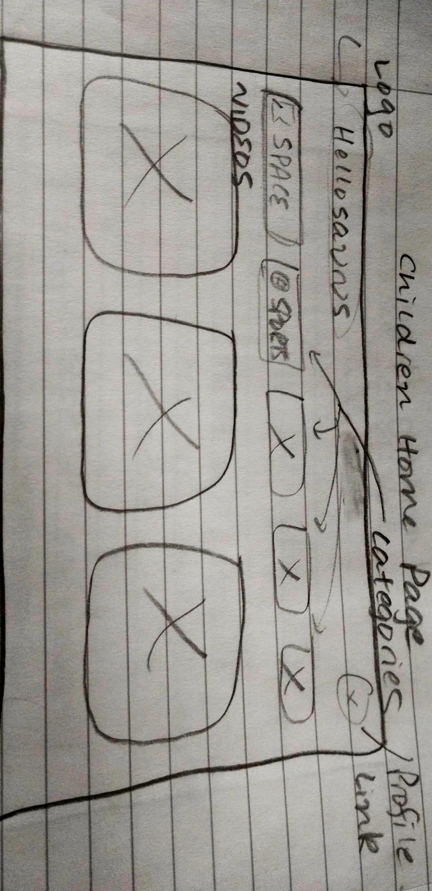
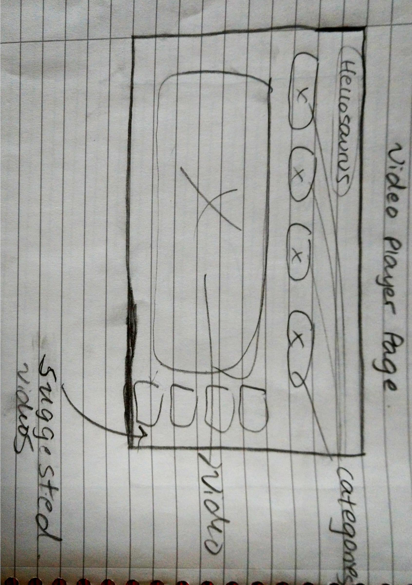
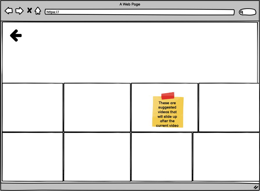
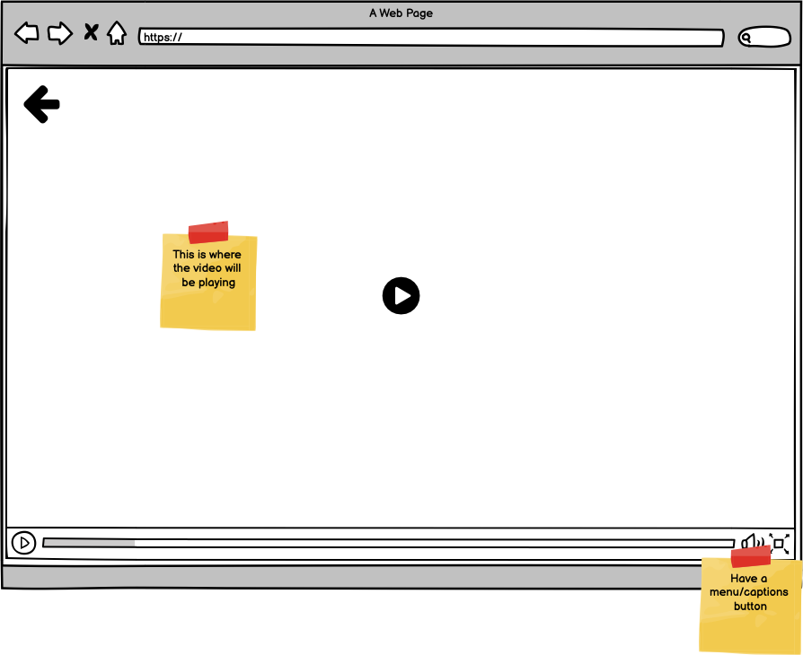
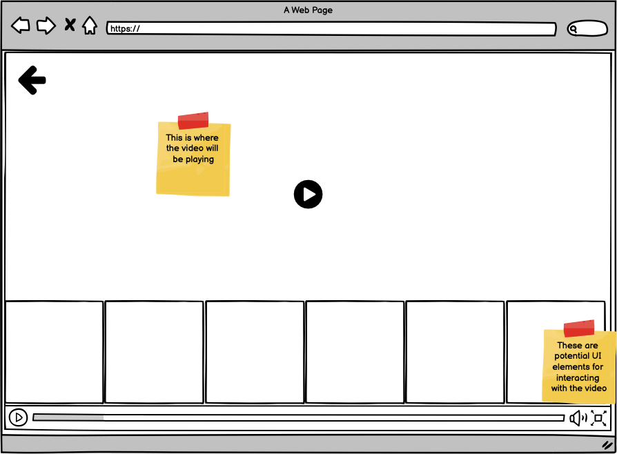
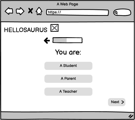
Before creating a prototype, we brainstormed a couple of different possible designs that our interface could incorporate. The following images are some of the many sketches we drew:
Low-Fi Prototype
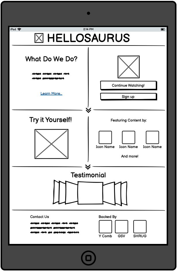
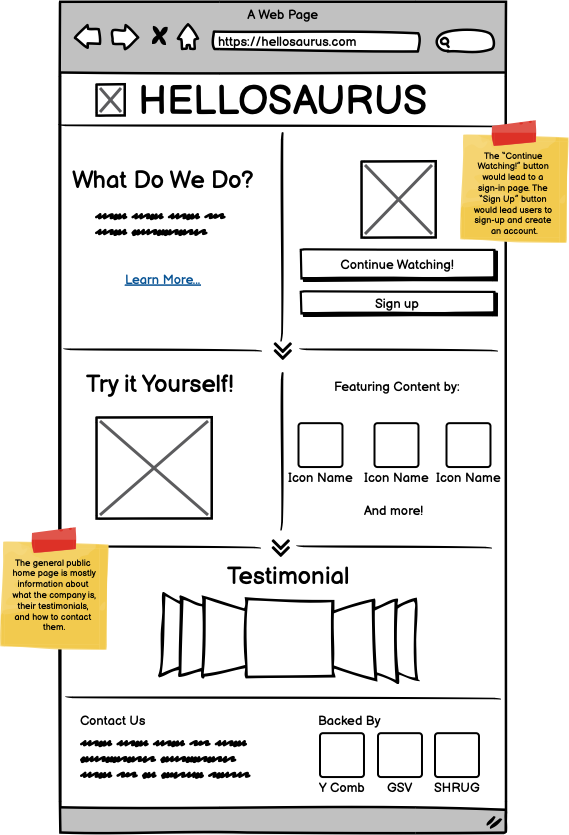
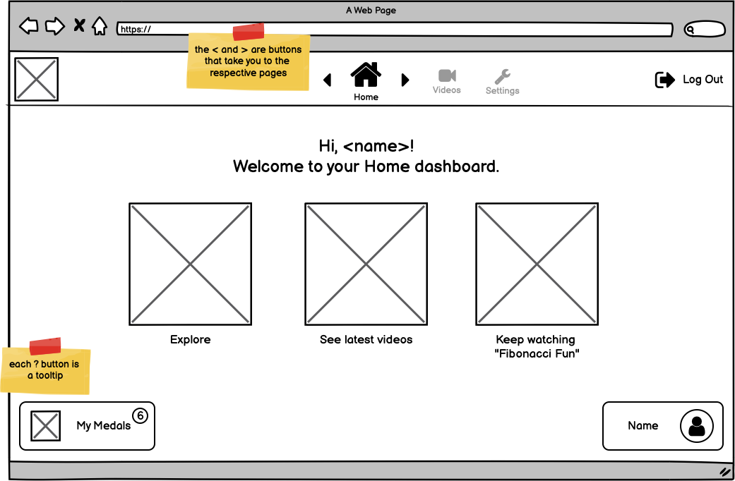
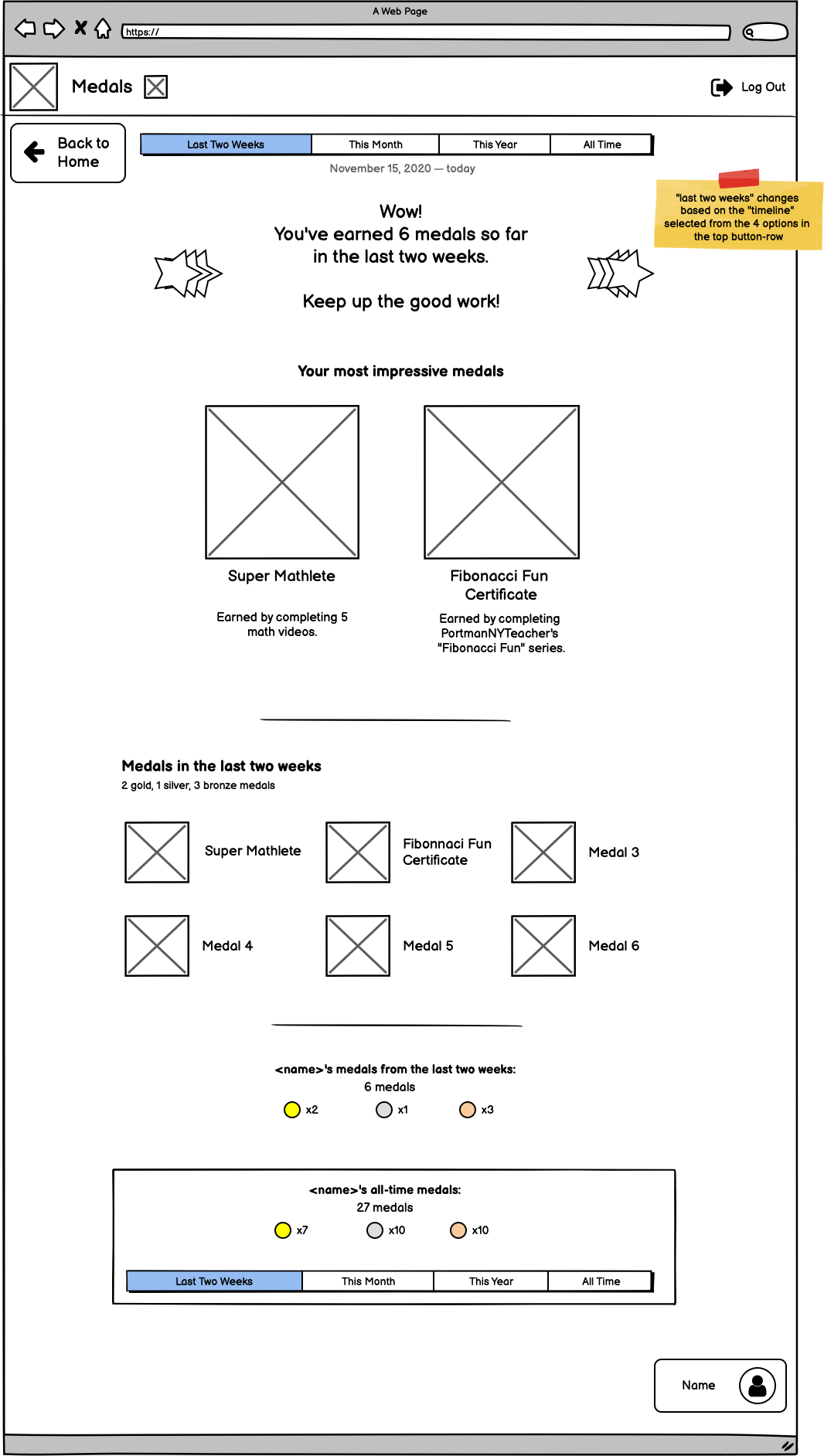
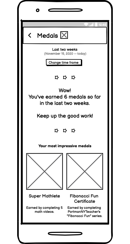
Since most users are going to be kids, we wanted to make our interface as kid-friendly as possible. We aimed to create a playful interface with more images and less text so that kids can quickly identify buttons or contents. Therefore, we chose to keep UI elements that are essential, affordable, and relatable. One of the creative ideas we thought of was to implement "medals" as part of a kid's reward program. We are creating interface kids that might be used to - for instance, through gaming apps or other in-person activities!
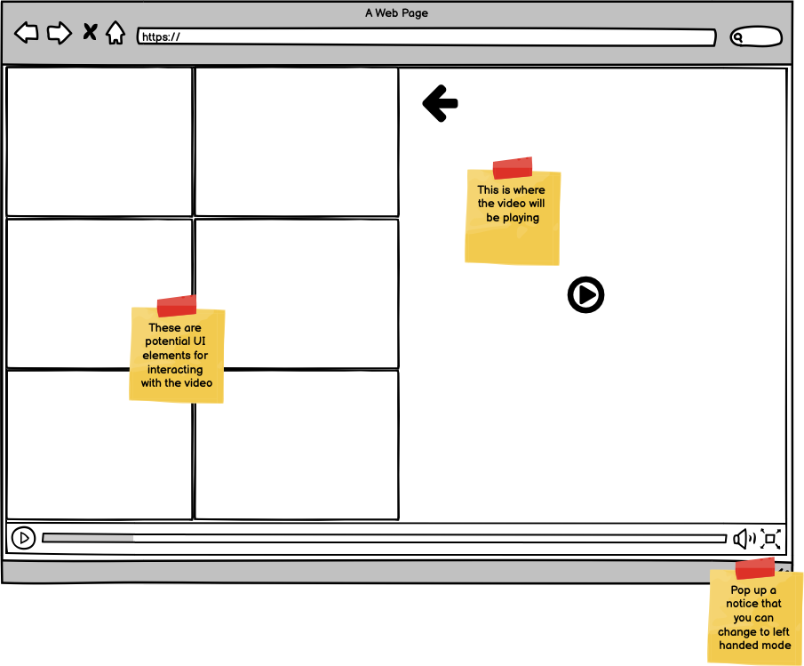
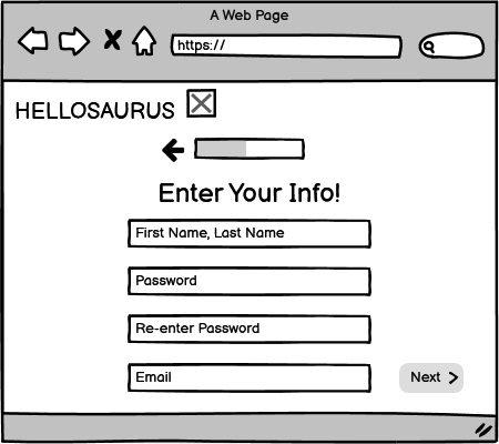
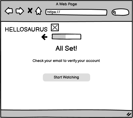
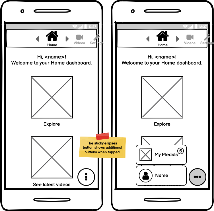
With these considerations, we created the following low-fidelity prototype:
Landing Page

Video Player
Sign Up Page

Dashboard Home
Dashboard Medals
Interactive High-Fi Prototype
Mockup Critique
For the mockup critique, users generally liked the playful design and felt it was well-suited for kids. In particular, users felt that the use of more colors was a positive feature and would make the site more attractive for kids.
Users felt that the "Keep Watching" button should not lead to sign up pages, which felt a little jarring. Similarly, returning users found it hard to find a "Log In" button which was not explicitely displayed.
For the video player pages, users felt that they needed a bit more consistency regarding how and where the options to interact with the video are displayed. They mostly preferred them to be on the bottom below the video instead of to the side. On the side, it made the "Back Button" seem like a button for hiding the options instead of going back to the previous page.
Final Version
This prototype is interactive - try clicking around!
User Testing
Our user testing fell into two groups: the first two people to test our site had trouble navigating the sign up process because the "Next" button that was at the bottom-right corner of the screen was not visible without scrolling. This was a flaw in the prototype because we used a screen with a 16:10 aspect ratio, such as a Macbook Pro, but our users were using a screen with a 16:9 aspect ratio. This showed us that it was important to make sure we design the site in such a way that all of the UI elements are visible without scrolling, which we thought we had done in our prototype but unfortunately was not the case on our users screens. The final user had only positive feedback, praising the large text, colorful design, large buttons, and good contrast of the elements. They even stated at one point "I did not have any questions or any confusion at any point navigating this website" and "I wish all websites were like this."
Between these tests, we were left with very little negative feedback other than making a change to the way the prototype was displayed to ensure that the entire vertical view would fit on the screen so that users could navigate the sign up process with ease.
Below are two of our user testing screen recordings. The first is the one where the user is successful in navigating the site, the second is where the user struggles to make it through the sign up process.
Takeaways
- No matter how many users you have, you still might not have the whole picture. This is why continuous user testing is so important!
- Sometimes very small details can make a large difference in the user experience.
- What separates good products from great ones are often final UI polishes and not cutting any corners in the design process.