Responsive Redesign: Ormsby's Computer Systems
For the reponsive redesign, I chose the website of Ormsby's Computer Systems, a local business near my hometown. The Original site was very basic and required a lot of scrolling to view its contents.
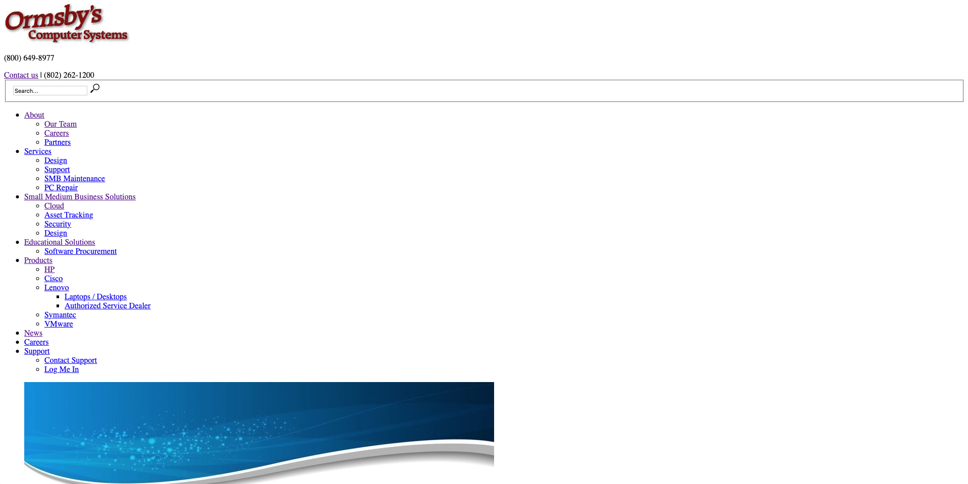
Some of the most glaring problems I noticed are as follows:
- The layout of the site makes it so that you must scroll down past the menu items on each page, making it difficult to view the content of the page itself since the menu items remain the same
- Everything is justified to the left of the screen, and essentially in one large list which makes it difficult to determine where to look for information and easily scan since everything is vertically stacked regardless of screen size
- Images are displayed inline rather than incorporated into the page itself which takes up a lot of space.
- There is no padding on the sides of the pages which means on desktop, the text takes up the entire width of the page which makes it difficult to read when it is just one long line
- Images do not resize with the window which makes the user need to scoll horizontally to view them, and viewing on a mobile device is unpleasant because of this
- Learnability: The site is not particularly intuitive at first glance and requires a lot of scrolling to find the desired information, but after figuring out the general layout, it is not particularly difficult to find what you want.
Useability:
The website is not as usable as it could be since horizontal space is not utilized efficiently in desktop mode, in tablet or mobile view, the images do not fit on the page so you need to either zoom out or scroll horizontally to view them. Since the images do not contain important information this isn't as much of a problem as it could be, but still not ideal.
Memorability:
The site is not particularly complex, so fairly easy to remember where information is stored, that being said, there are not many visual cues to direct your eye to important information, so a user might need to spend time locating information even if they have previously used the site.
Accessability:
After putting the site through WebAIM WAVE and using a screen reader with it, these were my findings: the screen reader experience on this page is relatively good, the only major issue is that the alt text on the images is the same as the links shown below the images so a screen reader repeats them twice.
Wireframe Mockups
To start the redesign, I first began by creating wireframe mockups of the new site in Balsamiq. I aimed to make the site more approachable by making better use of horizontal space than the original website, and adding a menu bar with dropdowns to easily navigate the entire site.
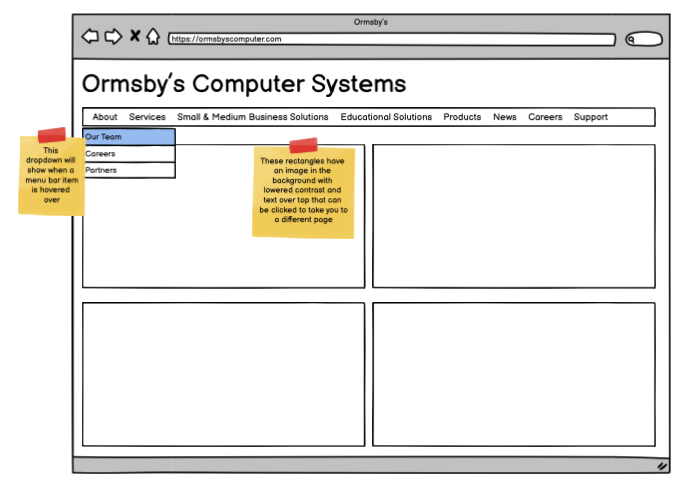
A wireframe mockup of the desktop view
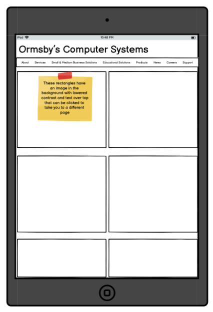
A wireframe mockup of the tablet view
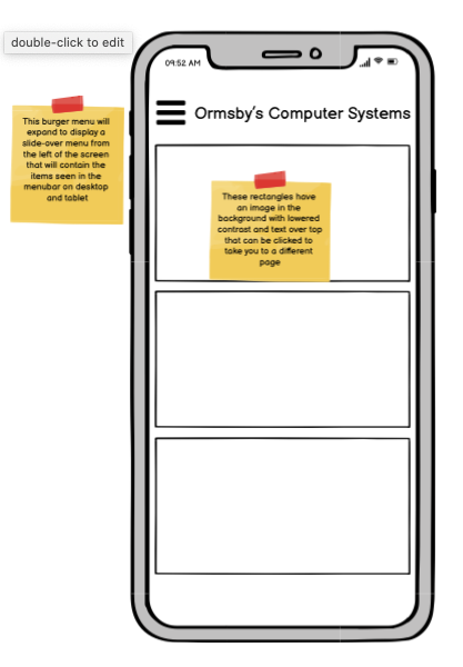
A wireframe mockup of the mobile view
Hi-Fi Mockups
Next, I created hi-fidelity mockups of my design in Figma, as well as visual design style guide. The style guide displays the reusable elements of my design, such as the menu bar buttons and the box elements that make up the main page.
A hi-fi mockup of the desktop view

A hi-fi mockup of the tablet view
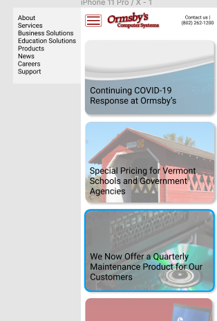
A hi-fi mockup of the mobile view
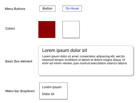
The visual design overview for my redesign
Final Design
For the final design, I worked to create the design seen in the hi-fi mockups. The page I designed was the homepage of the website, featuring some recent promotions the company was having as well as some news and general information. You can find the link to the webpage I created here.
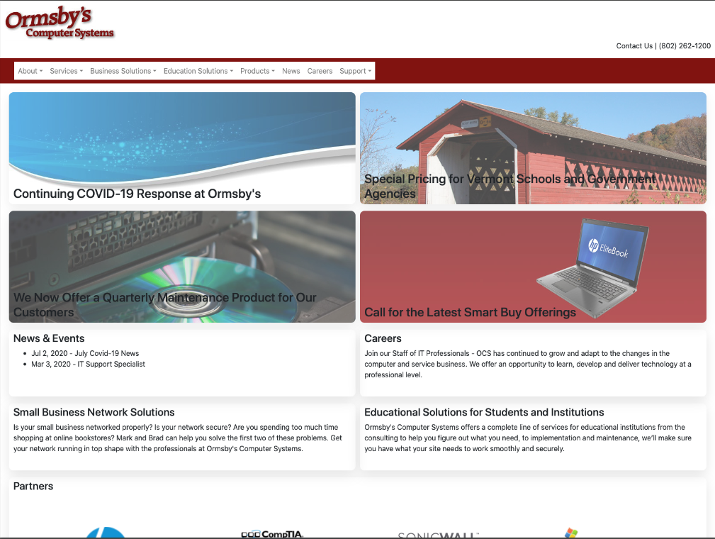
A screenshot of the desktop view of the final site
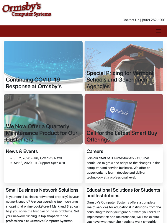
A screenshot of the tablet view of the final site

A screenshot of the mobile view of the final site
The final website is completely responsive to the size of the screen. You can see that as the screen width shrinks, the items in the grid become a single column rather than two for easy viewing, and the menu bar at the top of the page is hidden away into a burger menu for easy access that does not crowd the screen. While the original site had few accessability issues to begin with, the redesign is likewise accessable, easily navigable with a screen reader.
Final Thoughts
In this project, I was challenged to examine the flaws of a website and solve them with my own design. I certainly bumped up against many technical problems along the way, creating a website that is easy to navigate on various screen sizes was a worthy challenge, especially as I am fairly new to web development.